These are extra projects that are not required to pass the class, but came out anyway. Since I"m on a bit of a time-crunch to get this here blog updated before Friday, I'm sticking with the necessities, paragraph-wise. After the quarter ends you should start seeing more regular updates, plus the details for these little critterthings.
So, enjoy!
So, enjoy!
A bowl, glazed in purple and dark green; it turned a pastel-ish blue where they overlapped.
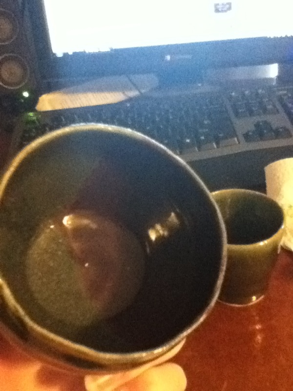
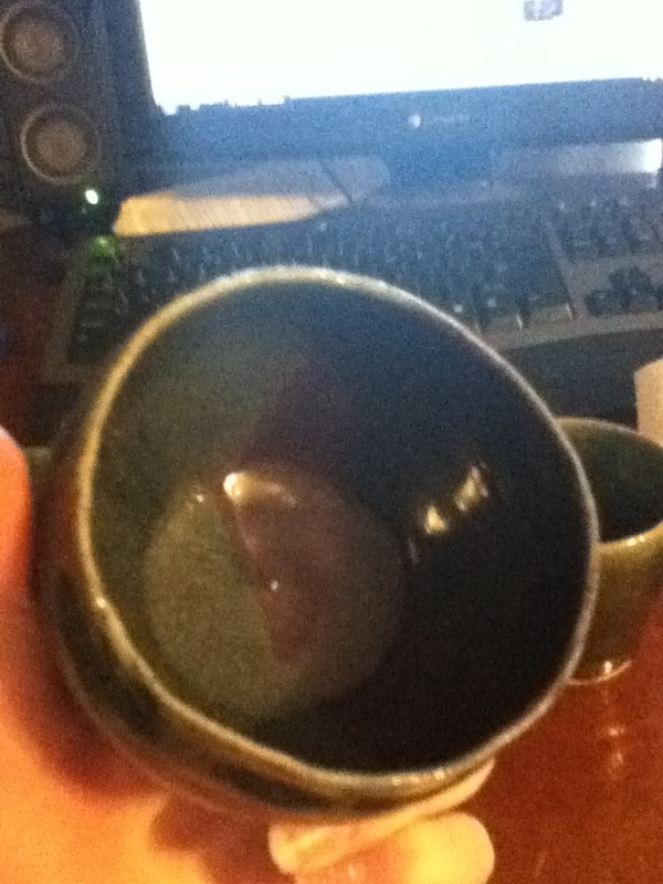
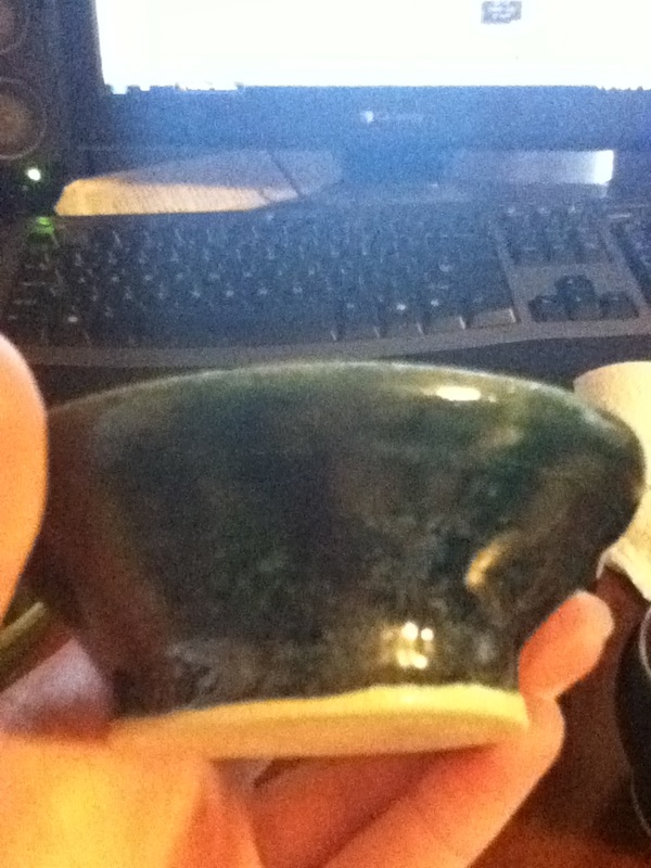
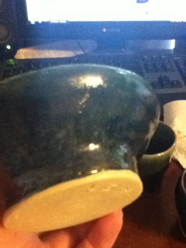
My favorite glaze-job by far. You'd have to see it in person, as it hardly shows up here, but it's this beautiful green-teal and blue, with the blue looking either crystalline, like a crowded starscape, or both. It's from dipping in Turquoise, then painting over it with Sand.
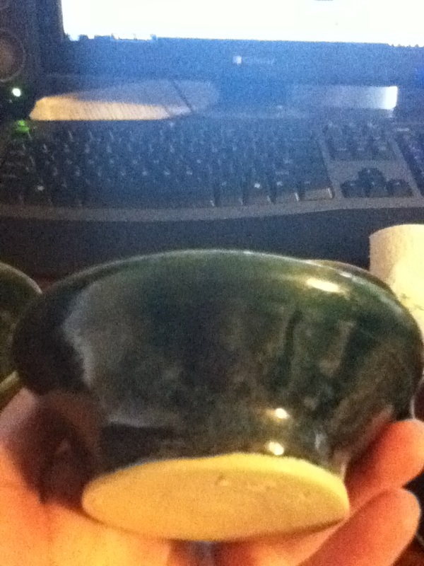
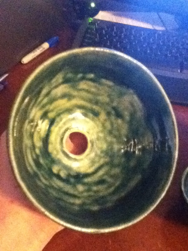
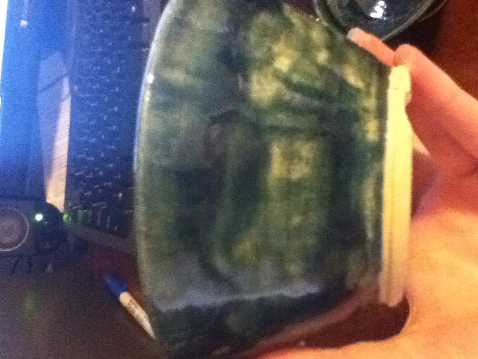
A planter pot I made for Mom. No, the hole is not an accident, it's so that the water can drain out; the notches in the footring are so the water can flow away from the pot. The outside body is a bad paint-job, sand over turquoise over sand over turquoise; the inside is turquoise over sand; and the rim is a dip in dark green (not Shadow). Ms. H likes the flowy look of the inside, and I have to agree with her, though the dark border where the green met the sand is my favorite part of the coloring.
 RSS Feed